Virtual Design Project (3/24/15-present)
For this project, I've been assigned to a team made up of three other people from three other class periods. The purpose of this project is to learn how to communicate with people won't be physically available at the same time that you are working. My team members include Fatima, Jordan, and Kyler. First we developed some general rules for our team.
We created the following team norms:
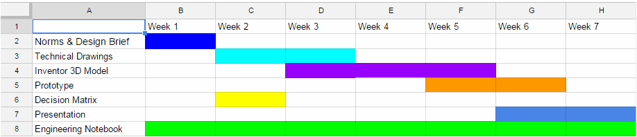
After the general meetings, we chose the locker design brief for our project. Kyler created this Gantt chart to create the pacing of our project:
We created the following team norms:
- sick days and absences are to be notified through email or GroupMe (-1 pt)
- communication through GroupMe (this just became email after GroupMe was blocked at school)
- we can work independently if we finish our designated tasks
- ask before changing the work of others or make changes as "save as"
- weekly Friday meetings after school to discuss progress
- send daily picture of notebook for other teammates
- daily message of what you've accomplished that day
- team majority when working out problems
- agree to be respectful of others' opinions
- fill out daily log on google docs
- for design decisions, we will vote for it
- save a new part if you have to make a decision on your own
After the general meetings, we chose the locker design brief for our project. Kyler created this Gantt chart to create the pacing of our project:
Defining the problem:
Client - School superintendent
Target consumer - High school students
Designer - Team 20
Problem statement - School lockers are a mess and students misplace supplies all over the place. Lunches get crushed and the clutter makes it difficult to completely close lockers.
Design Statement - Design a high school locker organization system that will neatly contain items commonly used and kept at school.
Constraints:
Generating Concepts:
The first step I took was to analyze our own school's lockers. I took their measurements so that our design could be formed to accommodate their size.
I also researched other locker designs on Google Images in order to get an idea of what's already out there in the market.
Client - School superintendent
Target consumer - High school students
Designer - Team 20
Problem statement - School lockers are a mess and students misplace supplies all over the place. Lunches get crushed and the clutter makes it difficult to completely close lockers.
Design Statement - Design a high school locker organization system that will neatly contain items commonly used and kept at school.
Constraints:
- Design must fit within your school locker.
- Design must be easy to install.
- Must hold/organize at least 5 items besides books.
- All items must be modeled and inserted in final assembly.
- No flammable materials may be used in the design.
Generating Concepts:
The first step I took was to analyze our own school's lockers. I took their measurements so that our design could be formed to accommodate their size.
I also researched other locker designs on Google Images in order to get an idea of what's already out there in the market.
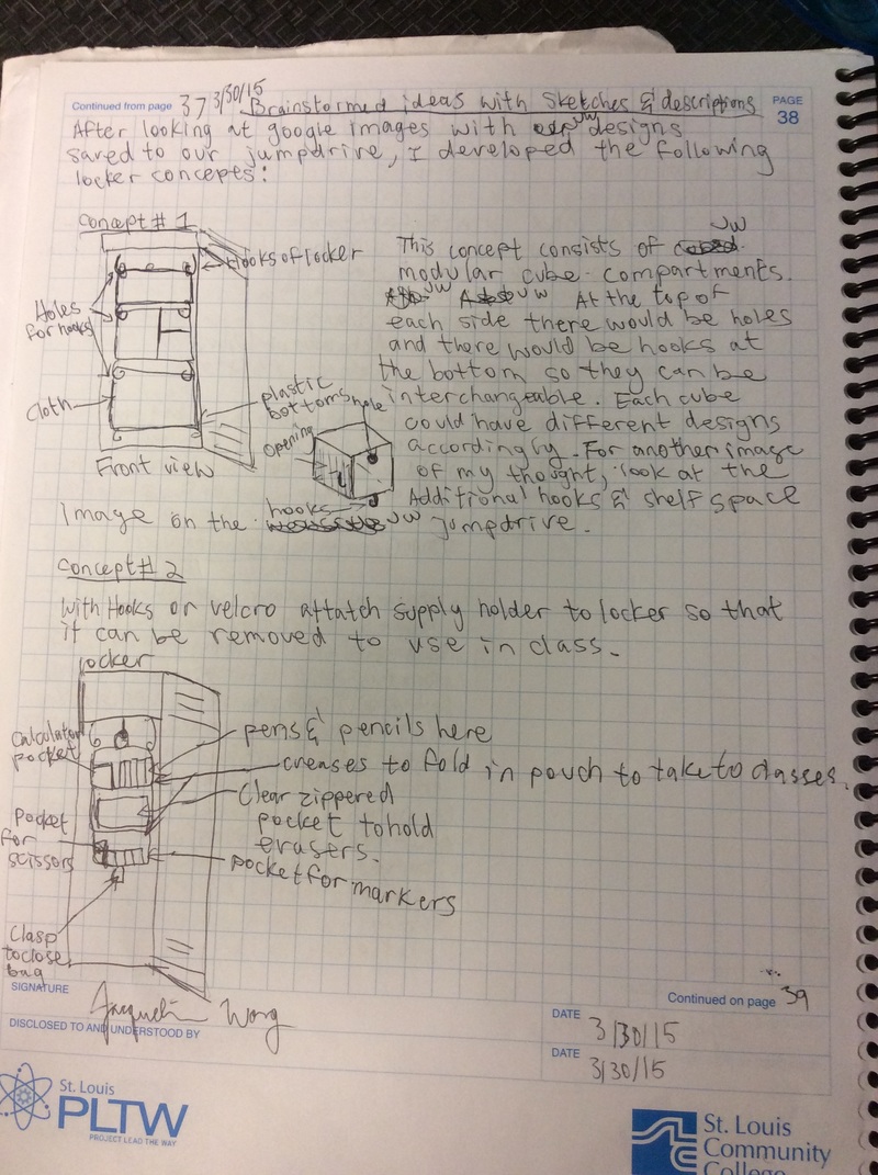
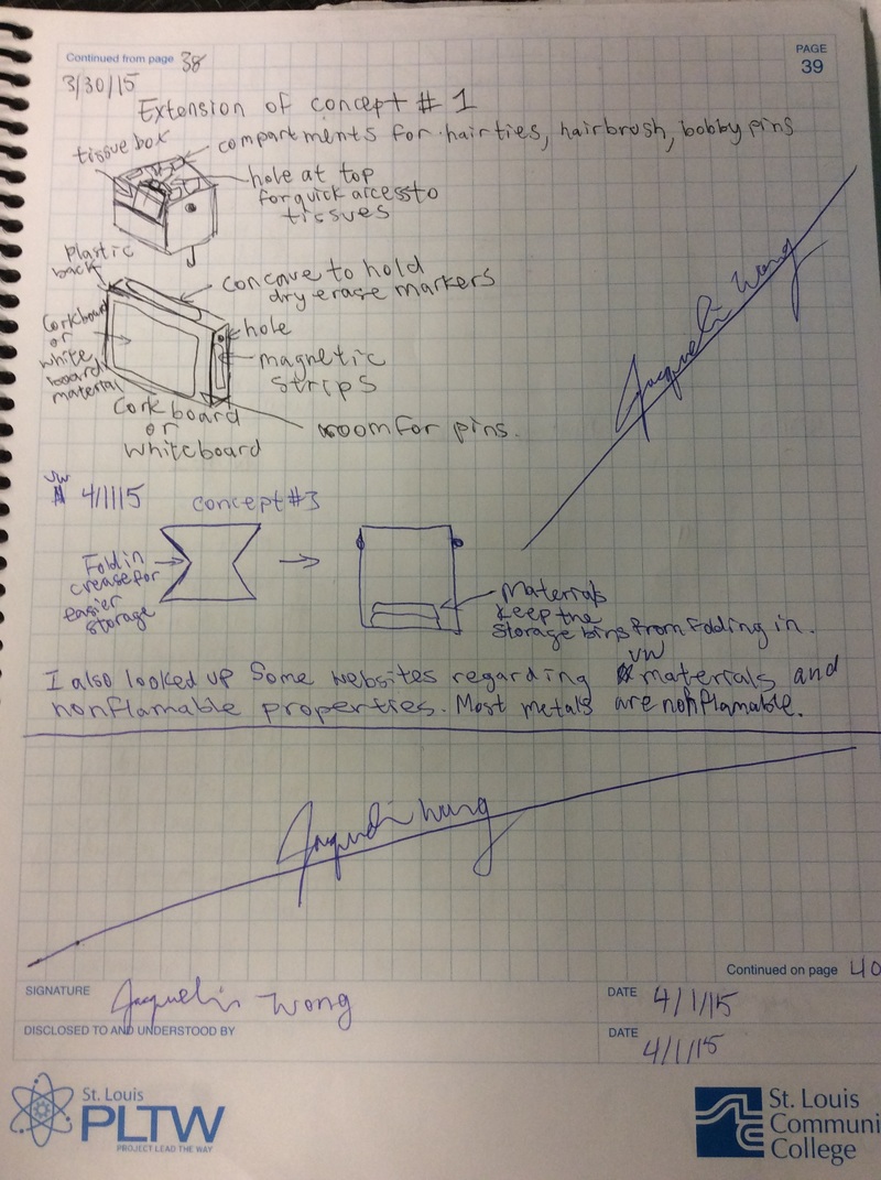
We met after school and created a list of items that could be organized with our design. We brainstormed the following supplies: pencils, pens, markers, erasers, calculator, stapler, clothes, lunchbox, headphones, tissues, mouthwash, goggles, post-its, hairbrush, cork board, dry erase boards, magnets, phone, glasses and sunglasses, keys, tape, hat, water bottle, hair ties, bobby pins, instruments, purses, ruler, compass, protractor, umbrella. Next, I began creating some concepts by sketching out some ideas.
|
To the right are my own sketches of some concepts I had. The team agreed that we wanted to give customers the option to be able to personalize the design. We wanted them to be able to switch things around as needed.
|
|
|
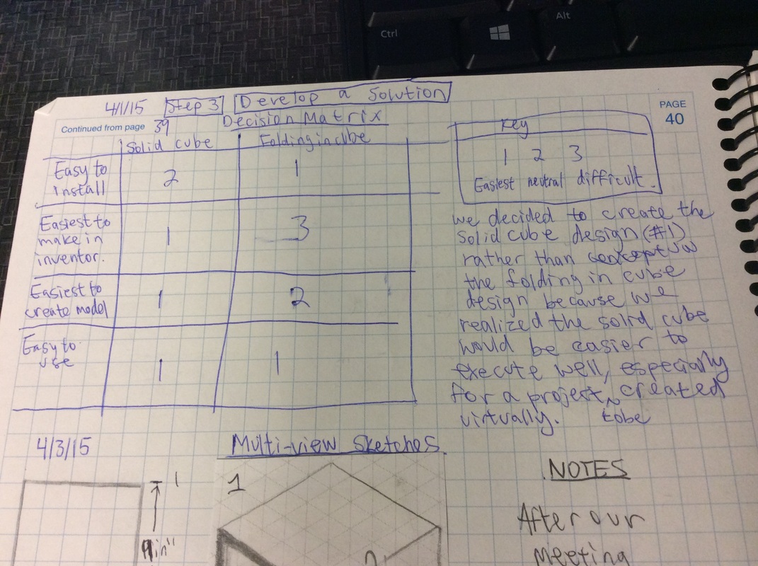
Developing a solution:
Our team met up again and we created a decision matrix together. We went to the lockers as a visual representation and we discussed the pros and cons of the designs. Here is our decision matrix and key:
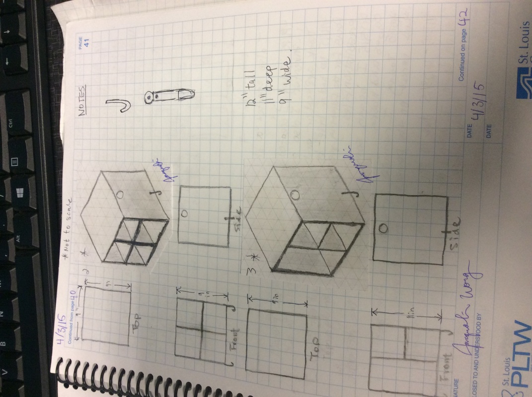
Then we created some working drawings:

|
|
Construct and test a prototype:
Afterwards, we worked on Inventor to create models of our design. We created parts, working drawings, assemblies, and technical drawings. We also modeled the items that we'd organize.
Evaluation:
I think that this project might have been one of my favorites. I was lucky to have a very enthusiastic team to work on our ideas. I think that for the time that was allotted to us, we did a great job working together! I am proud of our communication and motivation to keep the project going. While I like that our design gives the user a lot of choices, I think our design could be improved if we made some compartments a little more specialized for certain supplies. Although it's just a prototype, I think we could have made the physical model a little more aesthetically appealing to really sell the design for our presentation. Nevertheless, I think that this project was a great way to end the year!
I think that this project might have been one of my favorites. I was lucky to have a very enthusiastic team to work on our ideas. I think that for the time that was allotted to us, we did a great job working together! I am proud of our communication and motivation to keep the project going. While I like that our design gives the user a lot of choices, I think our design could be improved if we made some compartments a little more specialized for certain supplies. Although it's just a prototype, I think we could have made the physical model a little more aesthetically appealing to really sell the design for our presentation. Nevertheless, I think that this project was a great way to end the year!
Presentation:
Then with a lot of duct tape, hot glue, and patience, we finished our physical model!
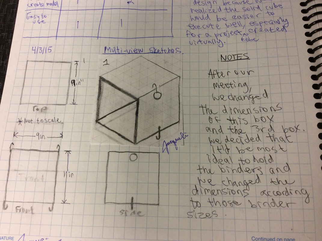
Unlike all of our other projects that we have done this year in class, this new project gives us much more freedom with the process. The project began by giving us three project options: a train, a button maker, or a phone case. I decided to create my own phone case.
My objective was to create a phone case with a scenic design. To begin, I created an isometric sketch of the phone case. I created a basic design of the phone and then I designed the back of the phone's design. After getting my design approved, I began measuring the dimensions of my current phone case to use as a guide. In the end, I think that this was a mistake. Rather than using an existing phone case, it probably would have been quicker to change dimensions based on the dimensions of the actual phone. I created some multi-view sketches that included these measurements. I also based some of the measurements off the working drawing of the iPhone.
It was now time to begin working on Inventor! I created the phone case by designing a simple rectangle and then extruding and filleting to get it to its current state. For the back design, I went by appearance and not practicality because that was my original intention: to have a phone case that would fit and have a simple but pleasing design. After creating the part file, I created a working drawing for my phone that features the dimensions.
Evaluation
After printing out my first version of my phone case, I realized my mistakes. For starters, I should have just used the numbers straight from the official Apple website for the dimensions of the phone. I also should have compensated to allow clearance for the space where the phone was to be housed. After seeing the results of these mistakes, I have changed the dimensions and will see if my phone can fit in the case afterwards. Despite building on the right axis, my design didn't show up, so that is another feature that I will try to print out again.
After printing out my first version of my phone case, I realized my mistakes. For starters, I should have just used the numbers straight from the official Apple website for the dimensions of the phone. I also should have compensated to allow clearance for the space where the phone was to be housed. After seeing the results of these mistakes, I have changed the dimensions and will see if my phone can fit in the case afterwards. Despite building on the right axis, my design didn't show up, so that is another feature that I will try to print out again.
Product Improvement Project (1/21/15-1/6/15)
After marketers noticed a dramatic increase of pen sales during the third quarter of school, the KQE Ball Pen manufacturing company hired me and my partner, Bianca , to implement additional improvements that would further boost sales and draw in a greater target audience of consumers. Thus the problem statement: The current design of the pen does not address a large enough demographic.
Our design statement: In order to improve sales, we have decide to create a new function and outer appearance for the pen so that it appeals to young children and an older audience as well.
Constraints: We were restricted to complete the task within two weeks and we were asked to create improvements that aren't too costly.
After that, we went to work a generated concepts as seen below. Here, you'll notice the list of ideas we had, the decision matrix we created, and our final decision. In the end we decided to split the work so that we each would make two different caps; I would be making the neck tie/lanyard cap and whale-shaped cap, while Bianca would be making the bunny-shaped cap and carabiner cap. We created sketches of our cap designs and material changes to the pen to enhance the appearance and potentially the performance.
We created these final versions of our prototypes in Inventor!
Working Drawings
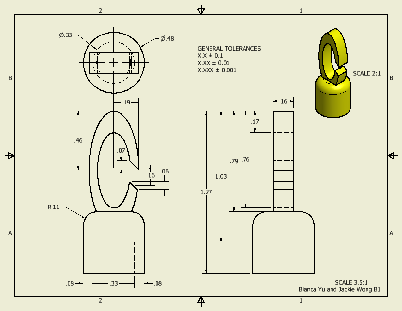
Carabiner cap
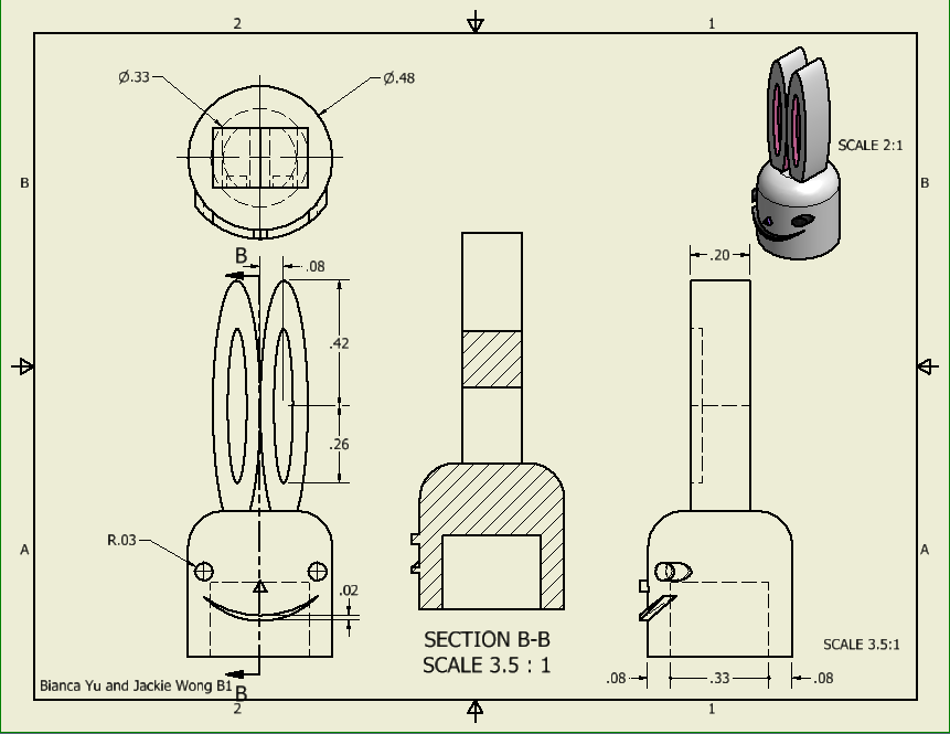
Bunny cap
Neck tie/lanyard cap
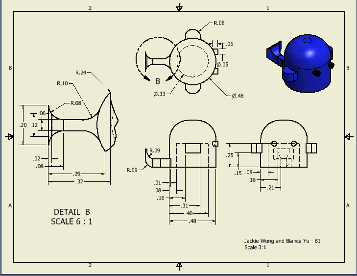
Whale Cap
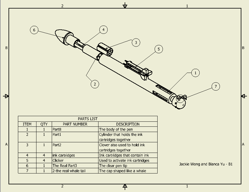
Final Assembly Drawing with List of Parts
Evaluation and suggestions
By the end of the project, we realized that we once again took on a task that was much more time constraining than anticipated. Even though we split up the amount of work, it was still more complex than we had previously thought. If I had more time, I would have spent more time on the whale to make it more life-like. For example, I would have added a blowhole, made the tail more realistic, and made the face with a little more detail. Also, I would have liked to have made even more styles of caps, to add an even greater variety to the market.
Reverse Engineering Project (11/17/14-12/4/14)
The Objective
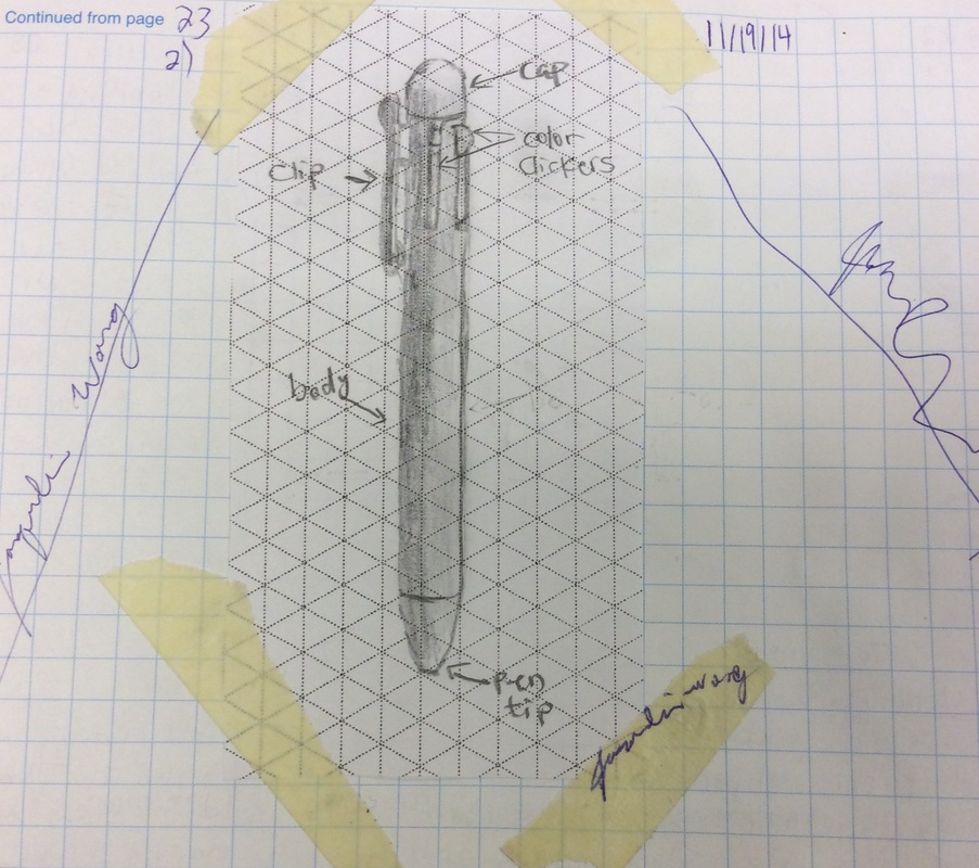
Our class was tasked to choose an object to reverse engineer. My classmate, Bianca, and I chose a multicolored pen to reverse engineer. We worked together to take apart the pen and work on the parts separately on Inventor. Our task was to include a visual, functional, and structural analysis of the pen.
Product: Multicolor Pen Manufacturer: KQE Ball Pen Target Consumer: Girls Model: k-8536 0.5mm
Product: Multicolor Pen Manufacturer: KQE Ball Pen Target Consumer: Girls Model: k-8536 0.5mm
The Object of Study


Front View Top View Side View
Visual Analysis
Front View of the Pen: The colors on the pen contrast with the white background of the whole component. The pen has a cylindrical form, although it is hard to tell on the front view. The front view is asymmetrical because of the larger clicker that also works as a clip. The shape is tapered to a point on one end and rounded into a sphere on the other. The pen includes a bunny, flowers, hearts, polka dots, and words. The polka dots follow a rhythm and are distributed evenly. The colors are balanced because all the colors are represented considerably evenly. The designs on the pen include curvy lines whereas the actual pen has straight lines. The pen is smooth and shiny. The shades of the colors on the pen are lighter than the colors on the clickers.
Side View of the Pen: The pen is shiny and smooth. On the side view, the pen is symmetrical. The patterns are similar to the ones found on the front view, excluding the bunny. The colors on the clickers standout compared to the white background of the main base portion. The pen also has a bar code and pen model printed on to the pen. The side shape is tapered to a point on one end and round into a sphere on the other. The form is still cylindrical. The colors are balanced and the dots and other decorative images are scattered uniformly.
Top View of the Pen: This view has vertical symmetry. Without looking at the additional parts on the sides, the pen has radial symmetry. The consistency of the yellow color puts emphasis on the other colors. There are four protruding parts from the main circular shape. This view is also shiny and smooth. This view also has economy because of its simplistic and plain design.
Functional Analysis
|
1)The pen's primary function is to be used for writing and drawing.
3)I believe that this pen operates, like most pens with the use of springs except that each pen color has its own spring. Additionally, there might be sliders and fitting parts that keep the ink cartridges locked in place. The caps and tips are probably threaded to connect the components. 4) Inputs: Ink, paper, force Product Function: Writing/doodles/notes, spring compression Output: Heat, markings, click sounds 5) The clickers that keep the ink cartridges locked into place as the main color used are visible when using the pen. 6) We cannot see what component causes the pen colors to spring back into the original position. It is also not very obvious what holds the different segments together. |
Number 2: Isometric Sketch
|
Structural Analysis
|
Using the caliper, we measured components of the pen for the structural analysis. We took apart the pen and discovered that the pen has a total of 8 unique parts. We measured our parts in inches. To the right you can see the tools, all the components of the pen, and our table that features all of the structural analysis.
|
|
Inventor Work
|
Working on inventor was both challenging, but overall very rewarding! First, we divided the work to create the 8 different parts. Afterwards we created an assembly file to put all the parts together. Lastly we created two separate presentation videos: one showing how the pen functions and one explosion video showing how the different components of the pen fit together.
|
EvaluationThis project was very long and difficult, but it was a great learning experience. Next time if we could do it again, I would try to measure the parts more accurately and precisely. It was really difficult to measure the parts because they were so tiny. If we had more time I would try to fix the tip of the pen on Inventor so that it would fit better to the body. If we wanted to take a step even further, I would have liked to make a better demonstration video where the ink cartridge moves into the color of use when we move the clicker towards the tip of the pen. It would also be cool if we could have added different colors for the clickers and springs in our assembly file. Make sure to check out my partner's website here!
|
Puzzle Cube Project (10/14/14-11/13/14)
Client: Fine Office Furniture, Inc.
Target Consumer: High school aged teenagers
Designer: I, Jackie Wong
Design Statement:
Our client, Fine Office Furniture, Inc., has a surplus of scrap .75in hardwood cubes and has asked us to design, build, test, document, and present a 3D puzzle cube. They hope to feature this item as a desktop novelty item on their showroom floor for high school students to solve.
Problem Statement:
Currently, Fine Office Furniture, Inc. is throwing out tens of thousands of excess cubes, and thus they are losing a great amount of potential profit.
Criteria:
I have been presented the following criteria:
1) The 3D puzzle system must be created from 27 .75in hardwood cubes.
2) There must be exactly a total of 5 puzzle parts.
3) Each puzzle piece must have between 4 to 6 cubes that are permanently attached to each other.
4) No two puzzle parts can be the same.
5) It must form a 2.25in cube.
6) Some puzzle parts should interlock.
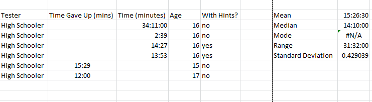
7) The puzzle should require high school students an average of 5 minutes to solve.
Concept Generation:
|
|
Constructing a prototype:
|
|
Technical Drawings:
While creating the prototype and pieces on Inventor, I hand sketched the multi view drawings of the five different pieces. I additionally created a drawing file for the pieces on Inventor, however, after we changed the orientation of the pieces based on the planes, some pieces reoriented and no longer followed the original plan.
Testing:
|
|
Video of the the pieces coming together: